BRAND IDENTITY
Built to Grow
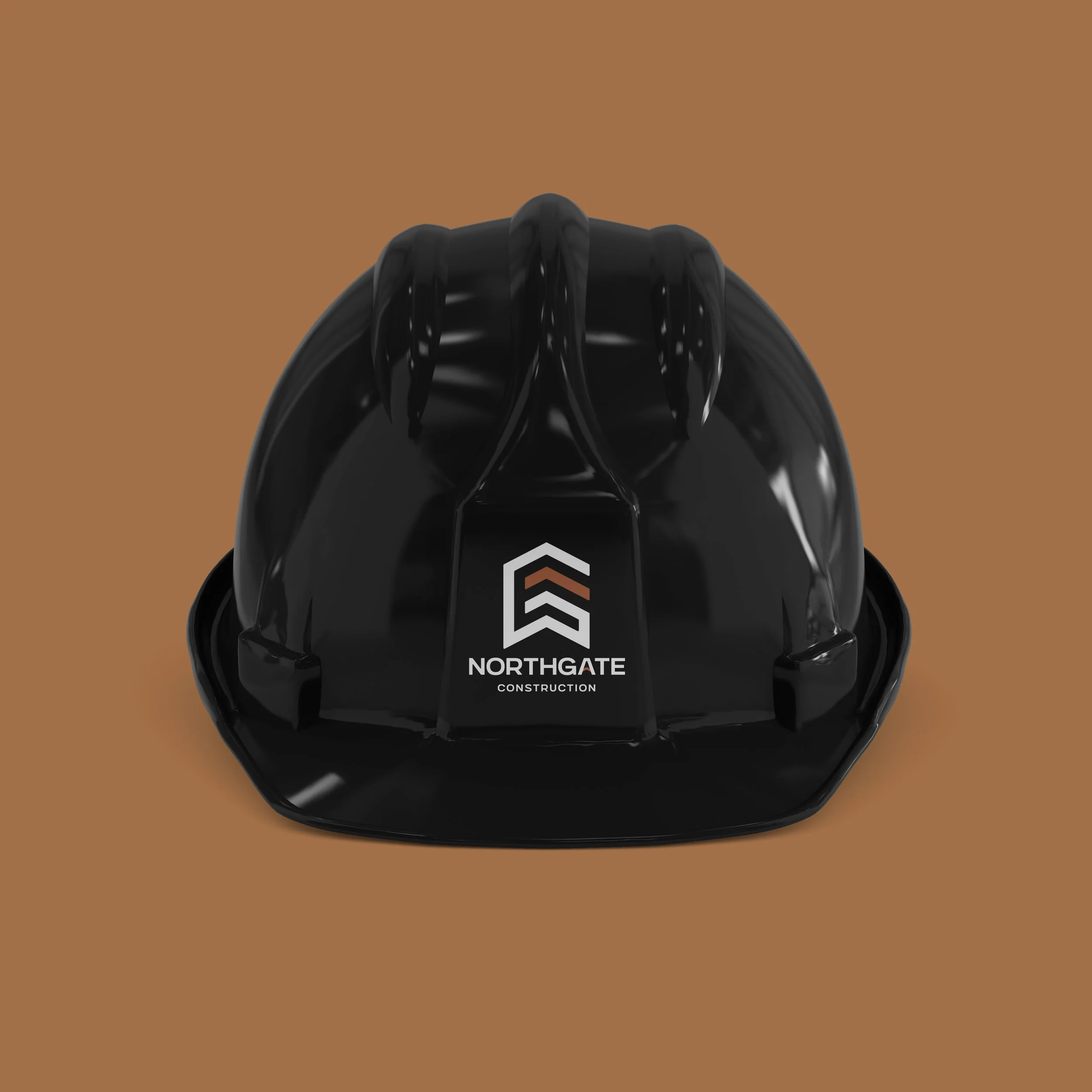
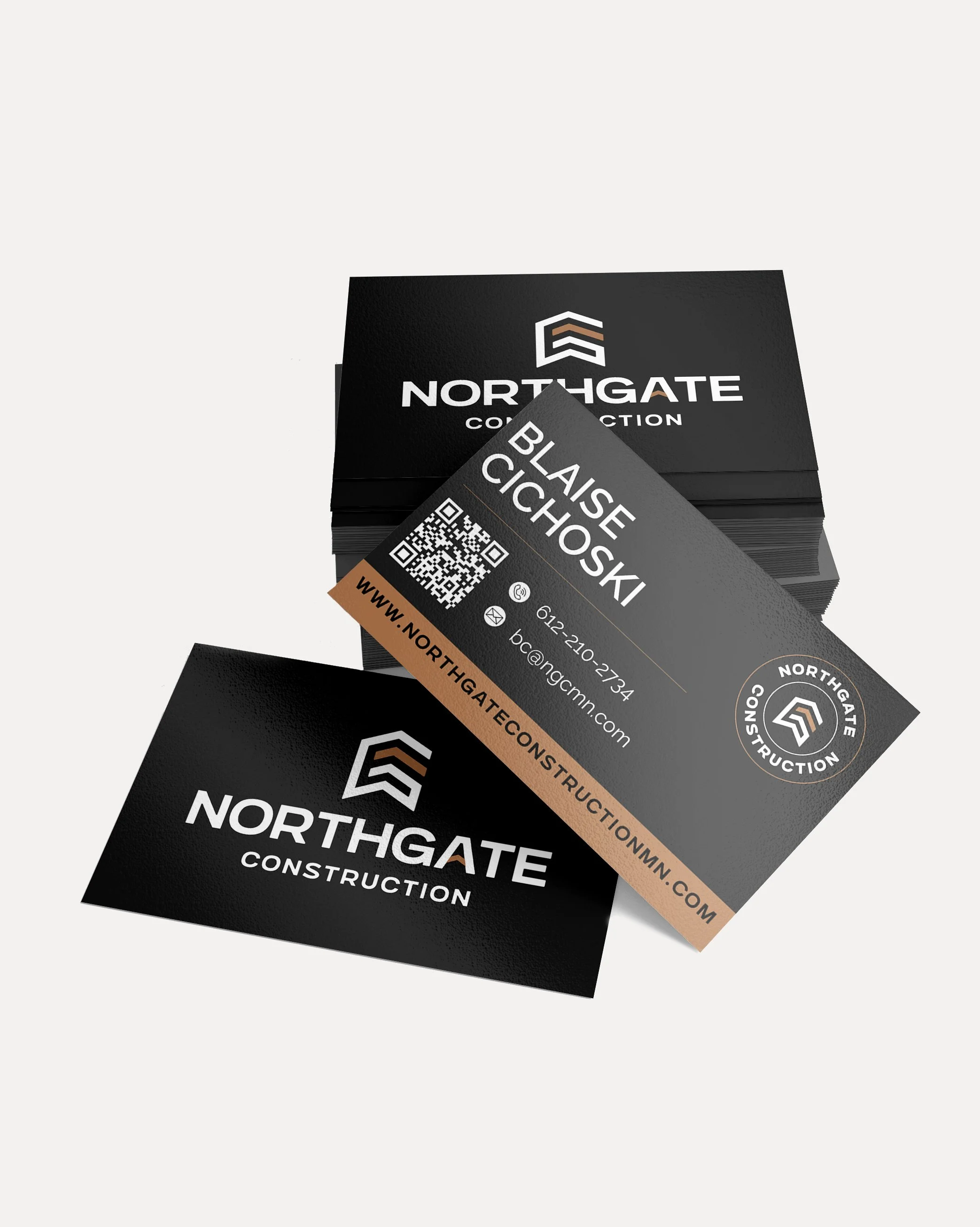
Northgate Construction launched quickly and found early success – but their original logo was simply created by a sign shop. While the business was thriving, the original logo lacked symbolism and didn’t reflect the professionalism clients experienced.

Built for the Future
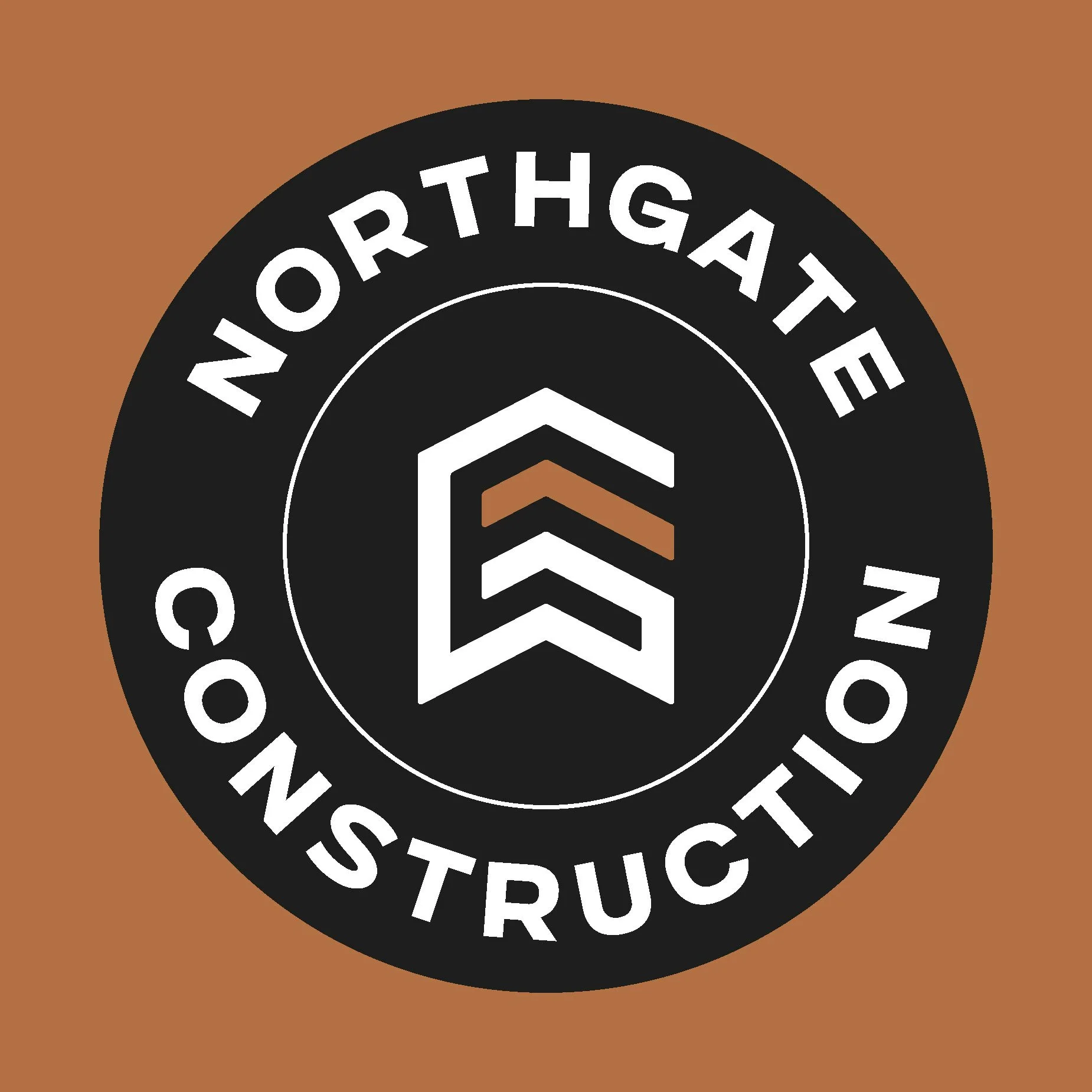
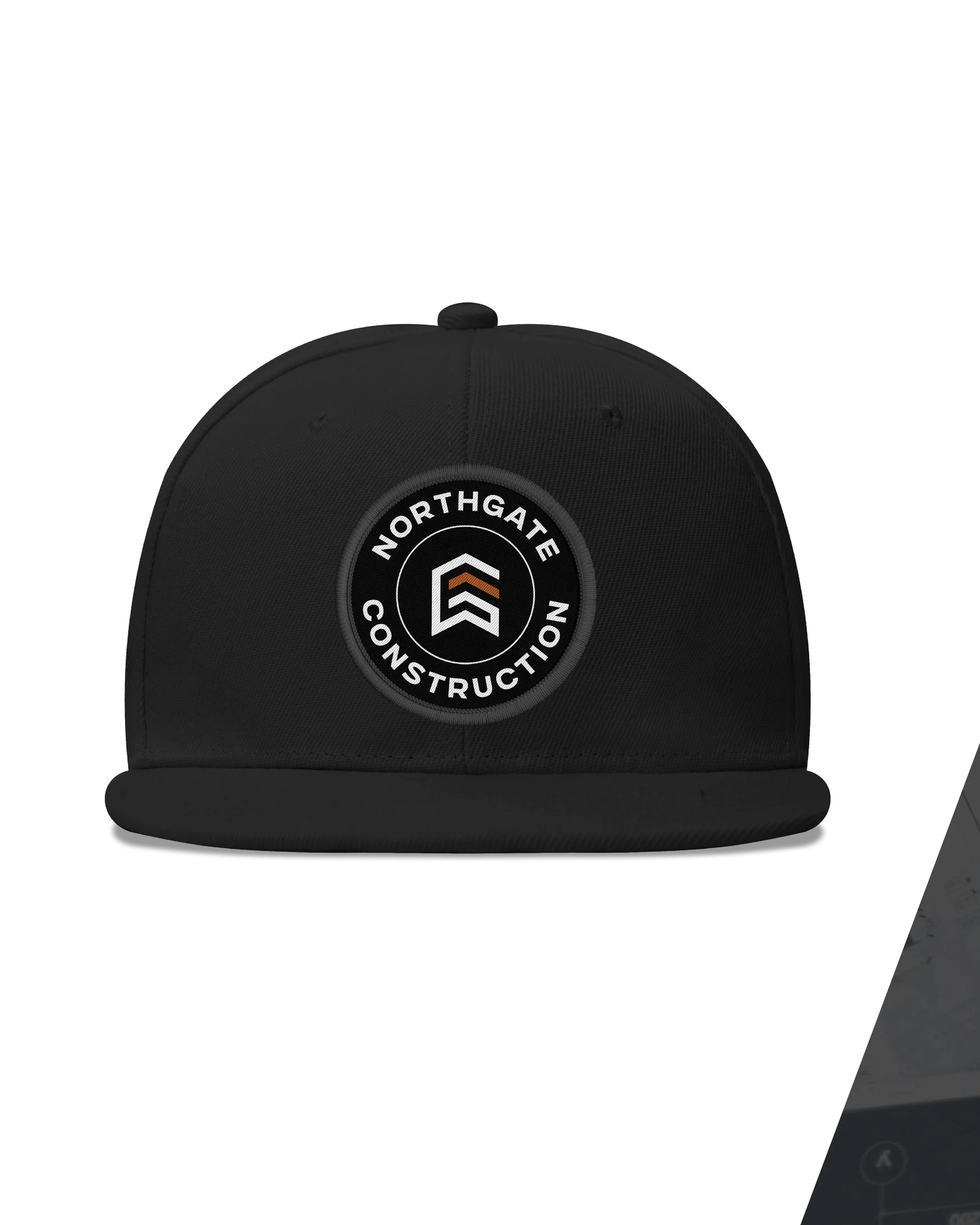
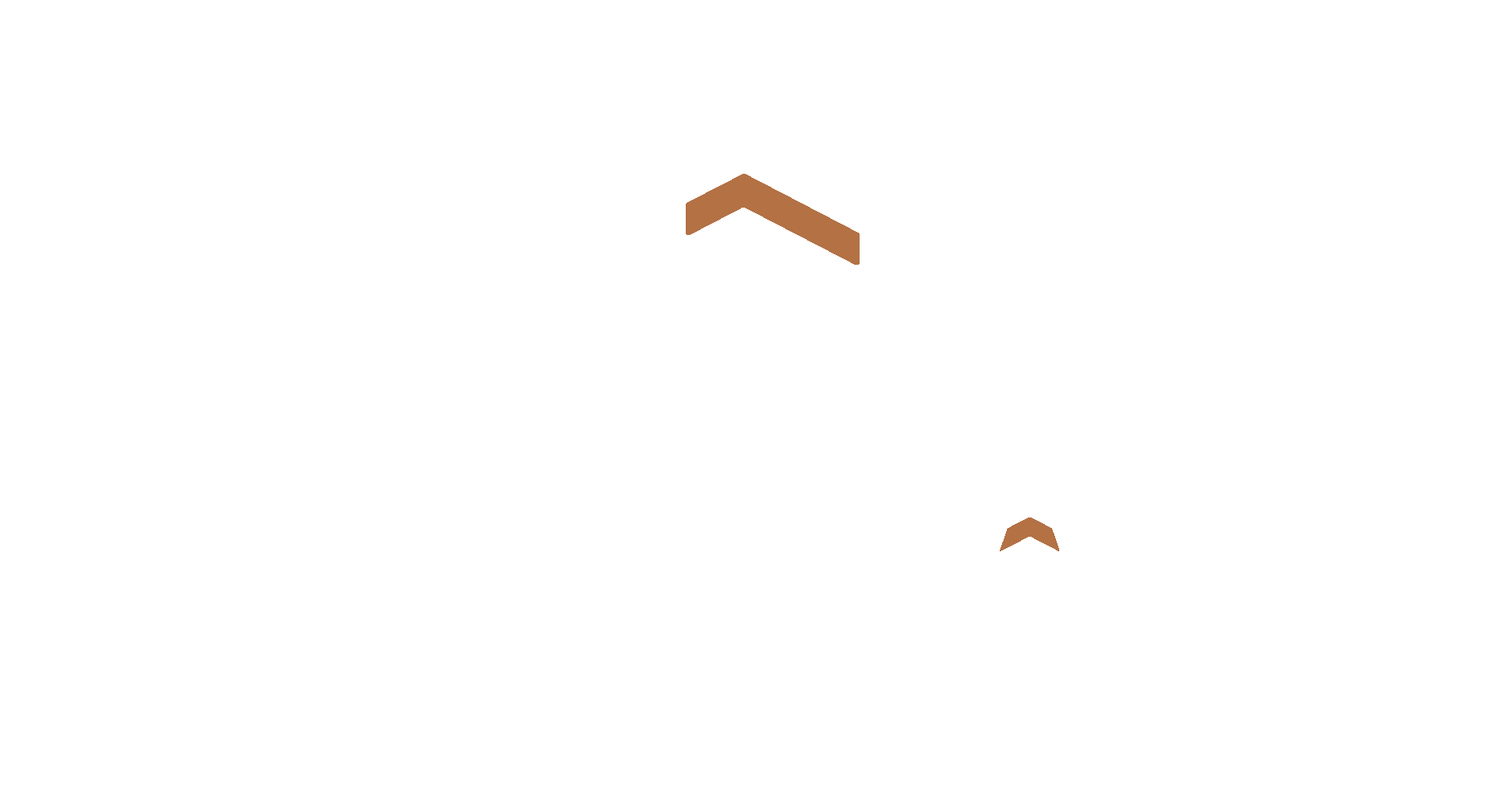
An upward arrow within the mark represents growth—mirroring the commercial buildings Northgate constructs and the momentum of the company itself.