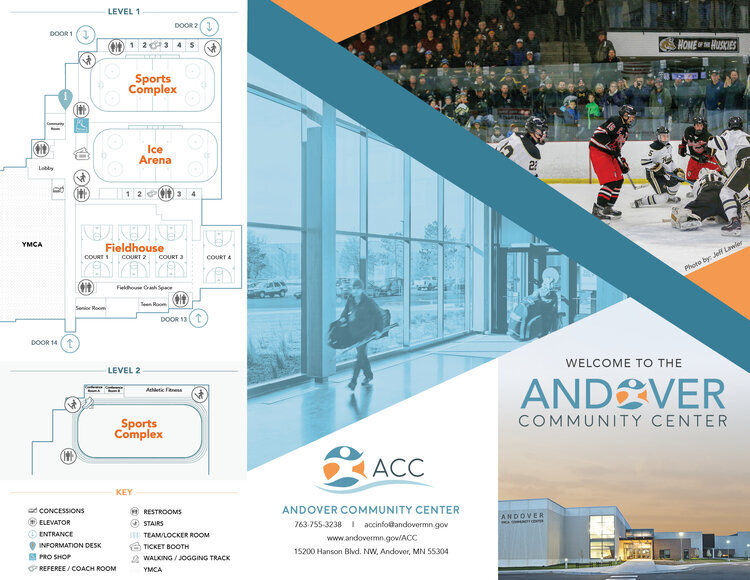
Client Spotlight: Andover Community Center
Your kids may have played a hockey game right on top of my design work and you never knew!

I’m proud that this is my 2nd Ice Center branding. And at this point, I’ve had more designs than I can track that have been printed on center ice between 3 separate ice arenas in Minnesota. What a sweet niche in my creative world.
The Andover Community Center is a recreation facility that has a partnership with the YMCA to offer amenities to their local community. The ACC has expanded its building and has added features such as a turf fieldhouse for indoor sports, walking track, basketball courts and another ice rink. Along with their expansion, they needed to freshen up their branding to showcase their new and improved features.
Our objective was to create a branding that is family-friendly, active, fun and inviting.
Branding always starts with the logo concepts and color palettes… and then it filters down to all the merch, signage, to little details like coffee cups in the concession stand, hockey pucks and other marketing materials. Scroll through to see a very small glimpse of the process from beginning to end. We just wrapped up some marketing materials that include a designed floor plan.