

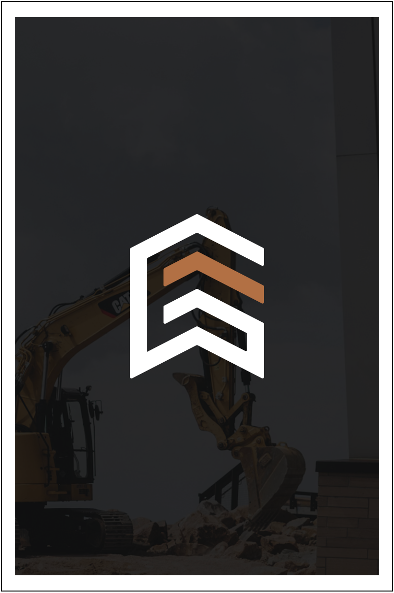
Northgate Construction
After rapid growth, Northgate needed a brand that better represented the professionalism and trust behind their work. The refreshed identity introduces strong architectural forms and an upward arrow—symbolizing growth, progress, and the buildings they bring to life.
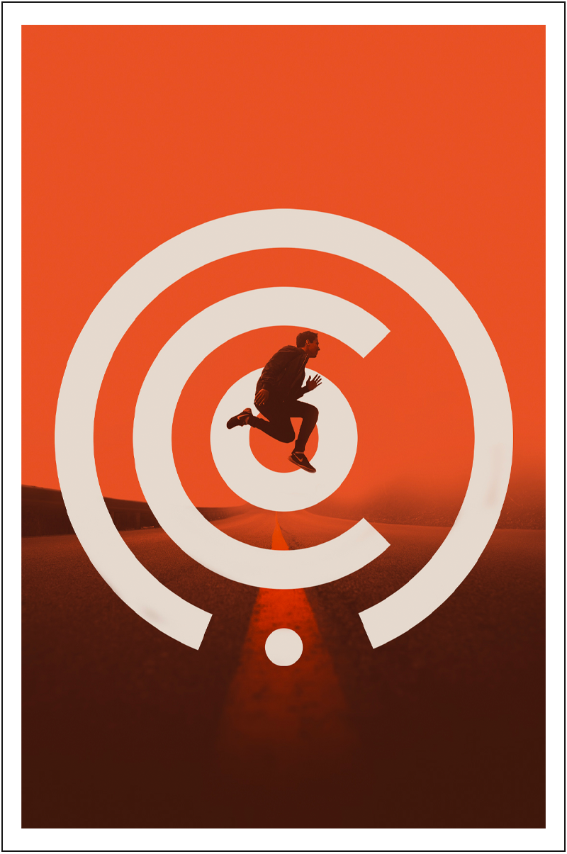
The Community Church (The Co.)
After changes in leadership, location, and name, this church needed a brand that created stability and belonging. The new identity reflects a welcoming space where curiosity, conversation, and authentic community come together.
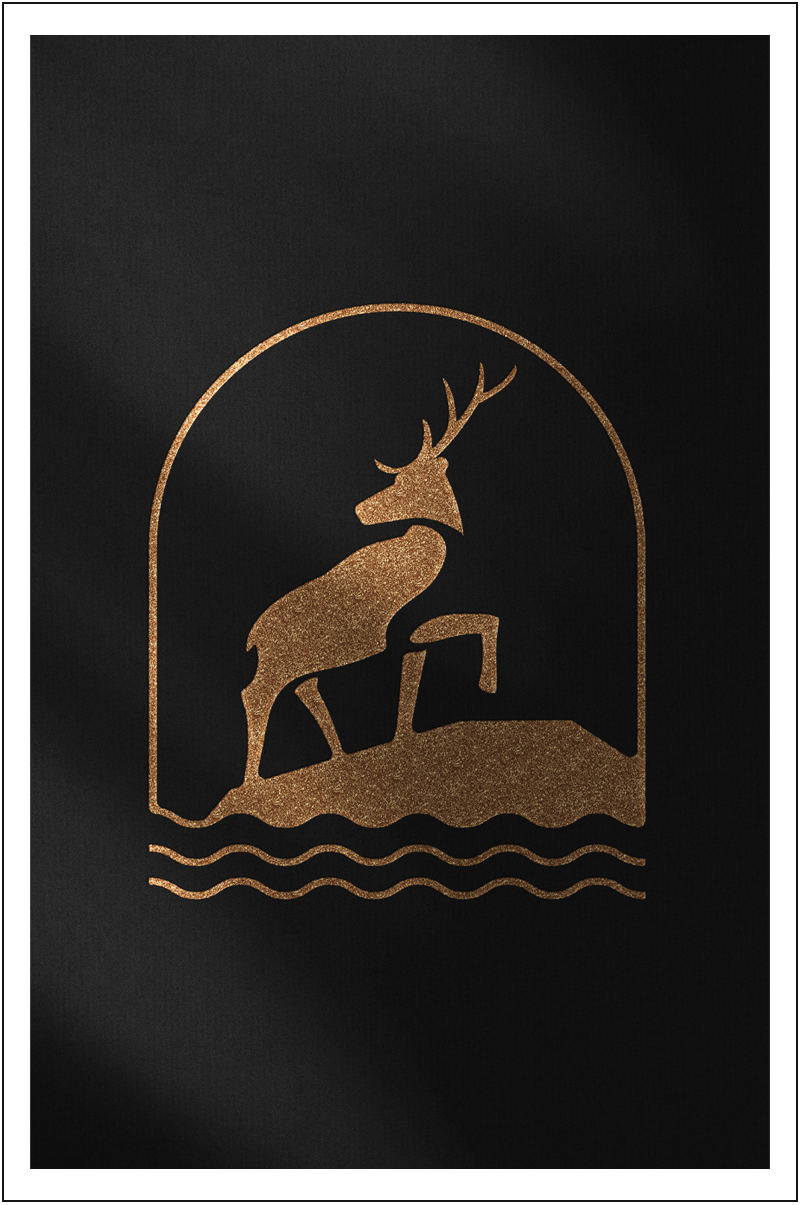
Edge Bar + Boutique - Elk River
The Edge Bar + Boutique wanted a special brandmark to add to their identity. Something more personal that speaks to the location in Elk River, Minnesota. This modern and sleek brandmark will be proudly worn by many locals, featuring a curved neck in the elk that resembles the ligature in the 'g’ of Edge’s current logo.
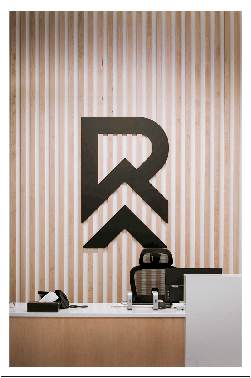
Renovation Church
As this thriving church community expanded its building and reach, the brand needed to grow alongside it. The refreshed identity honors the church’s journey while connecting with the growing families of the surrounding community.